Locked in a TV-watching lull, you suddenly realize that you have a hankering for a milkshake and fries. Why is that when you ate one hour ago? You’re not greedy. You’re not really a fast food lover either.
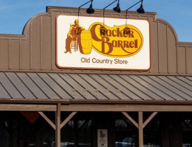
But you are being hypnotized by the restaurant’s red logo. Those visions of perfectly assembled burgers and fries are not figments of your imagination. They are a product of your subconscious. Thanks to us humans being hardwired from ancient times to associate red with food, you almost can’t help it.
Food marketers know this and use it heavily when branding. That’s why you see so much signage that uses the color red and why it’s flashing in your face while driving or watching TV. This video touches on the history of how red got its name, and its extensive emotional imprint that goes back thousands of years.
Psychologically, red is known to be a color associated with passion, stimulation, appetite, and ACTION. In terms of food, companies are in the business of getting you – as the consumer – to act. With red and the right color combinations, you will do just that. Are you hungry now?
Red is also connected to quick moving energy. That’s why it works so beautifully for fast food. McDonald’s and all the other staples want you to happily get in and out (pun there) in an efficient manner.
Believe it or not, some of your favorite fast food joints didn’t use these colors when they first started out. Most of their logos were black and white with a hint of color. Red didn’t really take over until the 1960s. It’s been like that ever since!
When combined with yellow, both colors grab your attention while imparting a feeling that you can grab a quick bite and feel satisfied – happy even. Notice whose logos feature red and yellow, or ketchup and mustard. As mentioned in the video, red can bump up your heart rate which in turn increases your hunger.
An article on Care2 points to research by color theory professor J.R. Morton who found that some ancient people avoided eating certain things that were in the purple or blue family because it could be toxic or spoiled. Much like the association with red evolved to appetite stimulation, colors like blue evolved to appetite suppression.
If you dig a little deeper into color, psychology, and marketing, you may question why brands like Starbucks do just fine by using a color like green. Well, green is generally seen as a warm, calming color.
It also reminds you of freshness and being healthy. Those are all feelings the company wants to invoke, which is why so many people sit and relax in there.
Food isn’t the only thing we link to the color red, as it holds significance in many cultures. Jump to the video to hear more about this bold color and its symbolism.
Did you know red was connected to ancient humans in this way? Are you affected by fast food color psychology tricks?